Google, 2016—2017
Google Jacquard: app for interactive garments
Impact
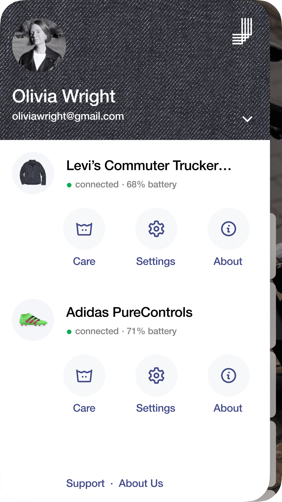
The app built the ground for the UX of the future Jacquard-based products by Samsonite, Adidas & Levi’s.


Products
Mobile app
Team
Motion Designer
Lead Designer (me)
What I Did
UX/UI & User research
UX/UI design
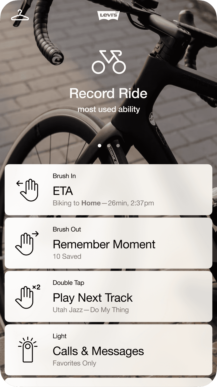
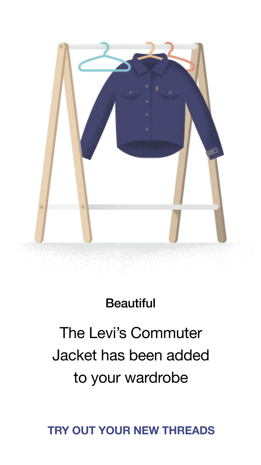
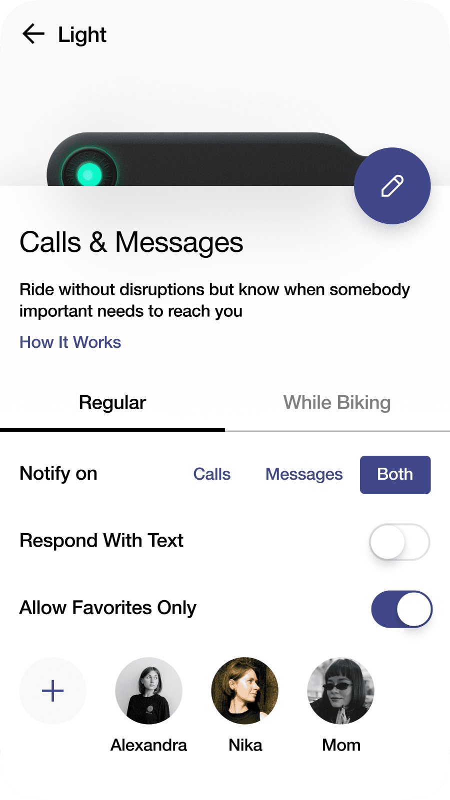
In 2016, Google and Levi’s introduced their first interactive garment, the Levi’s Commuter Trucker Jacket, made of the Jacquard fabric that reacts to the user’s gestures. The challenge was to create a mobile app that allowed for intuitive and fast control of all the garment’s interactivity, including assigning various actions like call and text management, music playback, navigation, and more, to the gestures that the garment recognizes.

The project goals were defined by the Clay agency PM and a Creative Director who had engaged in consultations with Google’s product team. Based on their takeaways, I got an understanding of the project objectives and product team’s technical capabilities and constraints.
Google’s objectives for the product
Providing a smooth learning curve for introducing the new technology.
Creating a scalable design to support future wearable releases.
Adhering to the newly developed Material Design language to support its establishment as Google’s official design system.
Google aimed to test the viability of the technology in the market quickly and on a limited budget. As a result, our team faced the constraint of not being able to conduct thorough user testing to validate designs before implementation. Google conducted user tests on their end and provided us with their findings.
I conducted a comprehensive analysis of the apps of major players in the wearables market, outlining their feature sets, information architecture, UX/UI practices, and visual styles. Based on these findings, I compiled a detailed 70+ page report, providing our team with valuable insights for informed design decisions moving forward.
While wearable technology had already existed in the form of watches and fitness bands, the Google Jacquard jacket presented a unique challenge in terms of UX/UI design.

Our first step was to develop a comprehensive understanding of the future app's structure and hierarchy by creating a spider diagram that included all entities and actions. After the Google product team approved the structure, we used it as the basis for creating high-fidelity wireframes for the entire app.
Here are some design approaches that served as the foundation for the whole system redesign.
1. Guided onboarding
During the onboarding process, users are required to set up their interactive garment by performing each gesture in a sequence. To simplify this process, we initiated the creation of mini video tutorials for each gesture. As the gesture is being performed by the user, parallel stacked lines at the bottom of the screen react sequentially, mapping its direction and intensity, and giving a visual and haptic feedback to the user's actions. In qualitative tests, conducted by Google, most users were able to complete this task successfully the first time.
2. Structure, colour coding, and meaningful iconography
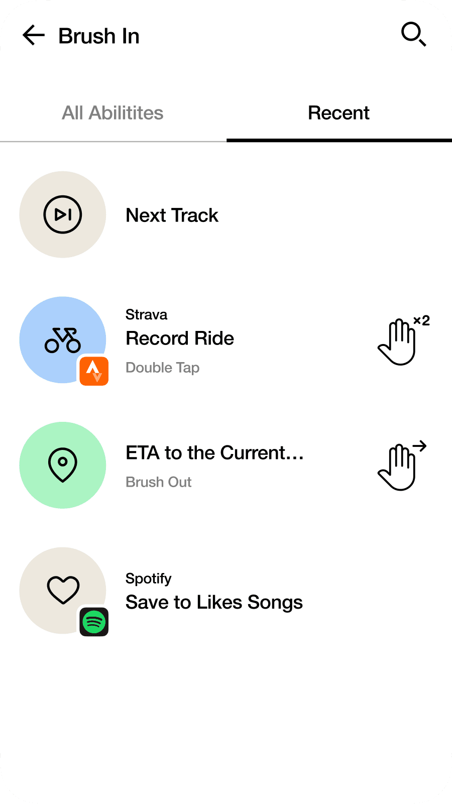
Google provided an extensive library of abilities that could be assigned to gestures. We grouped and sorted all the abilities, with each group assigned a unique colour and each ability given a memorable icon. This allowed users to quickly discover and access the desired functions without having to read through all the labels.
3. Consistency
I utilized the familiarity that users already had with other Google apps in order to smooth the learning curve and minimise any potential friction associated with a completely new technology. This allowed for easy inheritance of design principles such as logic, layering, controls, and fonts.
To this day, Google continues to use and evolve the app we designed, to provide customization and control over their interactive garments from brands such as Samsonite, Adidas, and Levi’s.
Julia's professionalism and discipline enabled us to have a fruitful collaboration with Google, despite time and budget constraints. We were able to create a product that met the client’s goals and expectations and continues to be used and evolved to this day.
Corsair iCUE: gaming gear control hub redesign
Speedtest: making it convenient for 100m+ people


