Corsair, 2019—2020
Corsair iCUE: gaming gear control hub redesign
+300%
Wordwide downloads
5m+
Active users a month
10m+
Worldwide installs

Products
Desktop app
Mobile app
Team
Project Manager
Senior Designer
UX/UI Director (me)
What I Did
Design audit
UX/UI & User research
Key UX/UI design
UX/UI direction
User testing
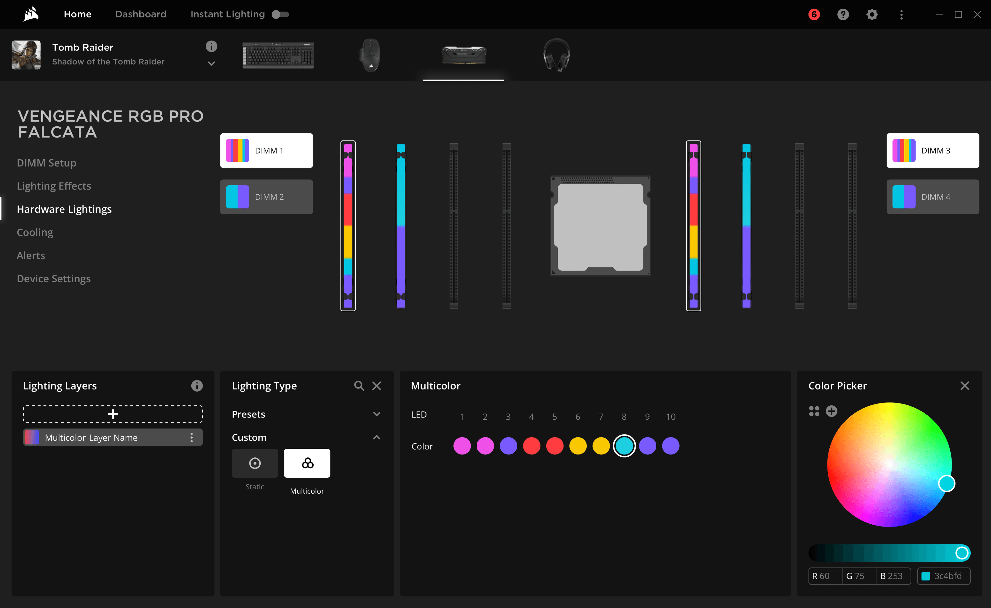
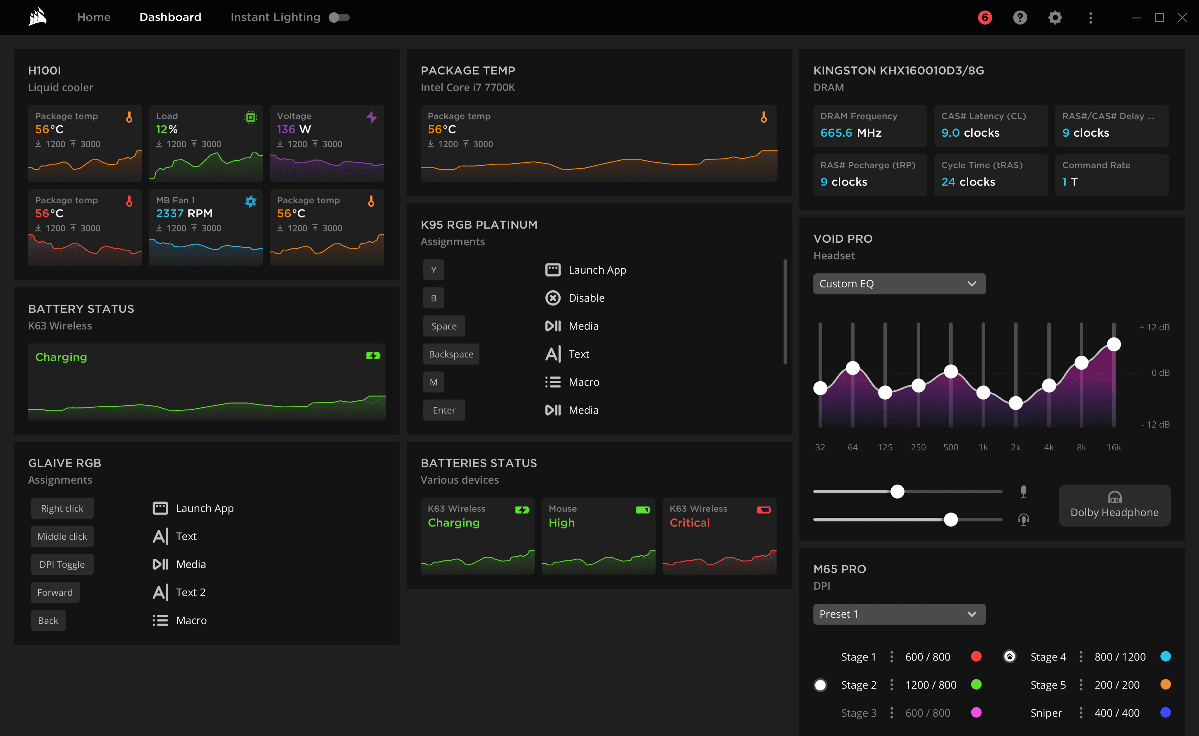
Corsair iCUE desktop app enables synchronisation between a PC, a wide range of peripherals, and games. It allows control over lighting, temperature, sound, tracking battery life and hardware statistics, and assigning game-specific multi-step macros to the action buttons and gestures of mice, keyboards, and headsets.
iCUE is an incredibly complex software by nature: each peripheral has its own set of abilities, and some have a six-level hierarchy of customizable properties.

As a hired Clay agency member, together with a PM and a Creative Director, I engaged in consultations with Corsair's Director of Product, CTO, and product team to gain an understanding of the project goals. To ensure clarity and alignment, I also communicated regularly with developers and understood their capabilities and technical constraints.
Business objectives for the app
Making iCUE easier to use
New hardware releases ongoing support
Promoting a comprehensive approach to gamers' desktop setups by enabling gamers to build a cohesive desktop ecosystem
Making iCUE user-friendly for beginners
Making the UI look and feel competitive with the top market players’.
In 2019, Corsair faced several challenges with iCUE:
Poor UX, resulting in low task completion rates and user frustration
Steep learning curve and a high threshold for entry
Mediocre CSAT
UI look and feel did not convey the company's innovative goals and was inferior to the competitors’
Support team high workload
Low scalability when it comes to adding new devices.
The project started with a comprehensive UX audit of the current iCUE software, with a primary focus on enhancing user-friendliness, simplifying UI, and analysing it from the user’s goals perspective. I created a 90-page presentation, providing a page-by-page analysis, and specific recommendations for improvement. This audit became a roadmap for our redesign.
Key Audit Insights
UX complexity causes user errors and lost data.
Navigation is confusing, hierarchy and nesting are not clear.
Common tasks take an irrational amount of time to complete and are not easily accessible.
Overwhelming amount of text across the system that could be replaced with graphics, iconography, or imagery.
Overly technical and intimidating look and feel of the UI.

Market Research
Together with a Senior UX/UI Designer we analysed direct and indirect iCUE competitors software, examining their feature sets, information architecture, UX/UI practices, and visual style. Our findings were presented in a 100+ page document that highlighted best practices to adopt and things to avoid, enabling us to make informed design decisions in the future.
User Research
Along with the PM, I interviewed 9 Corsair users with varying levels of proficiency and experience in using the app. Through these interviews, we gained valuable insights into their habits, challenges, and needs, including:
Types of users: ranging from those who primarily use their RGB devices for room lighting to professional gamers.
Gaming habits: how often and for what purposes they use iCUE while playing games.
User flows: their app usage patterns.
Device usage: the number of devices users have and how they customise and manage them.
Information tracking: which data users track and want to be notified about.
User opinions: opinions on the current iCUE software and how they think it can be improved.
Having access to passionate and unbiased users who voluntarily participated in the study was crucial for us to gain valuable insights into their needs and challenges. This allowed us to create a redesign that met both the business requirements and user needs.
Our initial step was to map out the existing iCUE version by creating a spider-like mind map, including all entities and actions. Analysing the scheme, we identified structural inconsistencies and proposed improvements to the hierarchy. We also used the scheme to document proposed changes to the feature set, which were later reviewed and approved during a workshop session with the client, taking into account competitor analysis and user research insights.
Once we had refined the spider IA scheme to incorporate the proposed feature set and structural edits, we used it to create high-fidelity wireframes for the entire system.
Together with a UX/UI designer we developed two approaches for the new navigation of the app. Given the significant changes, we conducted an prototype testing to compare the two options and evaluate the new UX against the old one. Corsair provided us with 5 users of varying proficiency levels and experience using the app, and we also recruited 2 users who had never used Corsair or similar software. Testing with experienced iCUE users enabled us to measure and predict the ease of transition from the old UI to the new one, which can often be challenging.
Based on the user testing results, we selected one approach that demonstrated the best task completion rate and user satisfaction.
Here are some design approaches that served as the foundation for the whole system redesign.
1. Removing excessive decoration
iCUE is an incredibly complex software by nature: each peripheral has its own set of abilities, and some have a six-level hierarchy of customizable properties. Furthermore, each setup can be saved as a ”profile,” and the number of profiles is unlimited. As a result, a lot of information and controls must be accessible on a single screen.
Before
After
2. User-Friendliness: From Texts to Visuals
Human brain processes images much faster and easier than text. Before the redesign, iCUE primarily relied on text lists to provide access to its features. However, given that each device has its unique set of properties, the items in those lists were inconsistently sorted across the system. Even experienced users had to scan through the lists to find what they needed.
Before
After
Before
After
Before
After
3. Shortcuts and Fast Tracks
This change was driven by our pursuit to achieve two business objectives for two user groups:
Experienced users: giving the ability to access their most used features quicker.
Beginners: simplifying and speeding up the learning process.
To achieve this, we used the user interviews takeaways, which determined the most frequently used keys, colour combinations, actions, and other elements, and created shortcuts for quick access to these features, as well as the ability to create those shortcuts by yourself.
This is only a partial glimpse into my design approach, as we also implemented various strategies such as enhancing the first-time user experience, creating tutorials for beginners, and improving the UX of each particular feature. In addition, we designed a mobile app with a unique use case of managing the lighting of all the devices and creating lighting scenes.

Before
After

Finally, together with a UX/UI designer we developed a comprehensive design system that included all design assets, such as colours, typography, icons, animation guidelines, responsiveness guidelines, interactive elements behaviour, and feedback principles.

After the redesign was completed, Corsair utilised the design system, guidelines, and principles we created to internally evolve the iCUE software. The response from Corsair's customers was overwhelmingly positive, resulting in multiple public reviews on platforms such as YouTube and HowToGeek.
+300%
Wordwide downloads
5m+
Active users a month
Julia and her team managed to turn the heavy and complex UI into a beautiful and intuitive control panel, drastically lowering the threshold and flattening the learning curve for the new users. The look and feel of the new iCUE now fully matches the innovative company goal and principals.
Speedtest: making it convenient for 100m+ people
Google Jacquard: app for interactive garments


